How to Color Grade Photos: Lightroom, Photoshop, and Free Options
How to color grade photos: correct first, then tint shadows, midtones, and highlights in Lightroom, Photoshop, or free apps. Plus where auto-matching fails.
Munib Ali Laghari
Founder & Lead Developer
Quick answer
How do you color grade a photo?
Correct the photo first: fix white balance and exposure so it looks natural. Then tint the shadows, midtones, and highlights toward the look you want, shape contrast with a curve, and use vibrance rather than saturation. Lightroom’s Color Grading panel does all of this. To copy a reference photo’s colors in one step, use EnhanceCraft’s color matching.
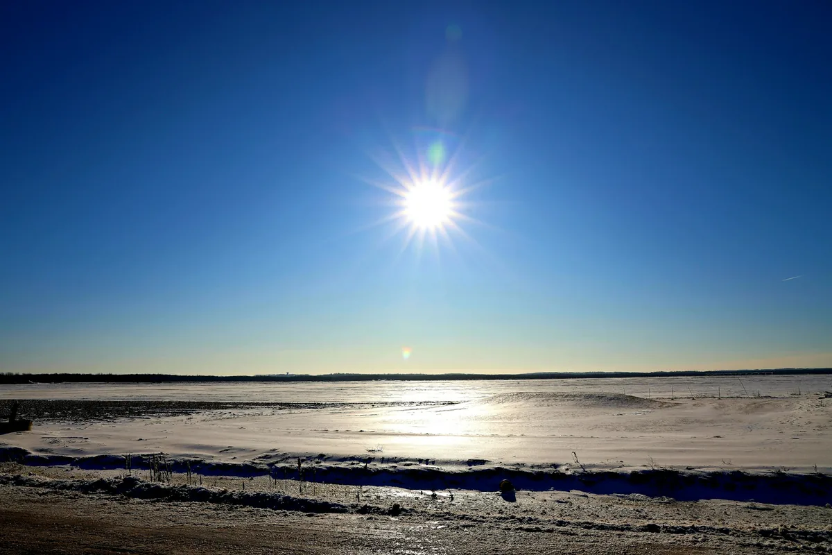
Before
After
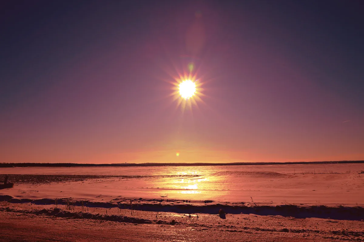
More examples like this: browse before & after results across every tool.
To color grade a photo, fix it first, then style it. Correct the white balance and exposure so the photo looks natural. Then tint the shadows, midtones, and highlights toward the mood you want, shape the contrast, and check that skin still looks like skin. Every editor that grades well, from Lightroom to a free desktop app, gives you those same few controls.
This guide walks through that workflow, shows where the controls live in Lightroom and Photoshop, gives recipes for the popular looks, and covers the free options. It ends with a test I ran on one-click color matching, because "match this photo's colors" sounds like grading in one step, and it often isn't.
A disclosure: I'm the founder of EnhanceCraft, an AI image toolkit, and our toolkit includes a reference-based color matching tool. I mention it where it fits, and I show where it fails. Everything about Adobe's apps below was checked against Adobe's own documentation in November 2026.
What Is Color Grading in Photography?
Color grading is the creative step of editing color: you shift a photo's colors and tones to create a mood or a consistent style. It comes after color correction, which is the technical step of making colors accurate. Correction asks "is this what was really there?" Grading asks "how should this feel?"
| Color correction | Color grading | |
|---|---|---|
| Goal | Accurate, natural color | A mood or a consistent style |
| Typical tools | White balance, exposure, contrast | Color wheels, curves, split tones, color matching |
| When | First | After the photo is corrected |
| Example | Removing the orange cast from indoor light | Teal shadows and warm highlights for a cinematic feel |
The order matters. If you grade a photo that still has a color cast, the grade sits on top of the cast, and every adjustment fights it. A product photographer might stop after correction, since accurate color is the whole job there. A portrait or travel photographer usually does both.
How to Color Grade a Photo in 5 Steps
The steps are the same in any app. Only the names of the panels change.
- 1.Correct the photo. Set white balance so whites look white, then fix exposure and contrast. If the photo looks wrong before you start, it will look wrong after the grade too.
- 2.Pick the look before you touch a slider. Name it ("warm and faded", "cool and moody") or find a reference photo you want to match. Without a target, grading turns into wandering.
- 3.Tint the tonal ranges. Push the shadows toward one color and the highlights toward another, usually opposites, like blue shadows and warm highlights. Leave the midtones close to neutral at first, because skin lives there.
- 4.Shape contrast and color strength. Use a tone curve for contrast, and prefer vibrance over saturation: vibrance boosts muted colors more than strong ones, so skin is less likely to turn orange.
- 5.Check and export. Zoom in on skin, white objects, and smooth skies. If a sky shows bands instead of a smooth gradient, back off. Then save the settings as a preset so the next photo starts in the same place.
Work from a RAW file if you have one. RAW keeps far more color and tone information than a JPEG, so you can push a grade further before skies band or shadows go muddy. JPEGs grade fine; they just break sooner.
How to Color Grade in Lightroom
Lightroom's Color Grading panel is the standard tool for this. Adobe introduced it in October 2020 in Lightroom, Lightroom Classic, Lightroom on mobile, and Camera Raw, where it replaced the old Split Toning panel. In Lightroom Classic, open a photo in the Develop module and scroll to Color Grading.
The panel has four color wheels:
- ●Shadows, Midtones, and Highlights. On desktop you can show all three at once in the 3-Way view.
- ●Global, which tints the whole photo.
How to use them:
- 1.Drag the handle inside a wheel. Its angle sets the hue, and its distance from the center sets how strong the tint is. A small move goes a long way, so start near the center.
- 2.Use the luminance slider under each wheel to brighten or darken that range.
- 3.Set Balance. It moves the dividing lines between the ranges. Drag it left and more of the photo counts as shadows, so your shadow tint spreads further. Drag it right and the highlight tint spreads instead.
- 4.Set Blending. It controls how much the three ranges overlap. The default is 50; higher values mix the tints into a softer, smoother look.
A simple starting grade: Shadows toward blue at low strength, Highlights toward orange at low strength, Midtones untouched, Blending around 50. Then adjust Balance until the split falls where you want it.
To grade a set of photos, save your settings as a preset or copy them to the other photos. Keep in mind that a preset applies the same change to every photo. If the photos were shot in different light, they'll still differ after the preset, which is why matching a whole set to one reference is a separate job.
On mobile: Lightroom's app has the same wheels under the Color panel, in Grading, without the desktop 3-Way view. The app is free to download with paid Premium features, and Adobe moves features between tiers, so check what your plan includes.
How to Color Grade in Photoshop
Photoshop gives you three routes. Pick the one that matches how much control you want.
1. The Camera Raw Filter (the easiest). Choose Filter > Camera Raw Filter, open the Color Grading section in the Edit panel, and use the same wheels, Blending, and Balance controls as Lightroom. If you already know Lightroom, you already know this. Convert the layer to a Smart Object first and the filter stays editable.
2. Adjustment layers (the most control). Grading in Photoshop's own tools usually means stacking a few adjustment layers:
- ●Curves: adjust the red, green, and blue channels separately. Lifting blue in the shadows and lowering it in the highlights gives you blue shadows and warmer highlights.
- ●Color Balance: tint shadows, midtones, and highlights separately.
- ●Gradient Map: set to a low opacity, it maps dark-to-light tones onto a color ramp for a stylized look.
Because each is a layer, you can mask it to keep a grade off a face, or lower its opacity to soften it.
3. Match Color (copy another photo's colors). Open both photos, select the one you want to change, and choose Image > Adjustments > Match Color. Under Image Statistics, pick the other photo as the Source. Then tune Luminance, Color Intensity, and Fade, which pulls the effect back toward the original. Neutralize removes a color cast. Adobe notes that Match Color works only in RGB mode. It's the same idea as one-click color matching, with the same strengths and weaknesses, which I tested below.
Popular Color Grading Looks and How to Build Them
Most popular looks come down to which way the shadows and highlights lean and how much saturation you keep. These are starting points; adjust them by eye.
| Look | Shadows | Highlights | Saturation and contrast | Works well for |
|---|---|---|---|---|
| Teal and orange | Teal or blue | Warm orange | Normal saturation, medium contrast | Portraits, travel, city shots |
| Warm film | Slightly lifted, warm | Soft yellow | Lower saturation, gentle contrast | Lifestyle, golden hour, weddings |
| Cool and moody | Deep blue or green | Neutral or slightly cool | Lower saturation, darker midtones | Landscapes, rain, night |
| Bright and airy | Lifted, neutral | Slightly warm | Low saturation, low contrast | Interiors, food, flat lays |
| Black and white with a tint | Cool | Warm | Saturation at zero first, then tint | Portraits, street |
Teal and orange works because skin tones sit in the warm midtones and highlights, while backgrounds, skies, and shadows fall toward teal. The contrast between the two makes people stand out. Push it too far and skin turns orange, so watch the faces.
How to Color Grade Photos Online or on Your Phone (Free)
You can grade for free. You just get fewer controls or less precision:
- ●GIMP (free desktop app): Colors > Color Balance lets you pick Shadows, Midtones, or Highlights and shift each between cyan and red, magenta and green, and yellow and blue. Tick Preserve luminosity so the tint doesn't change brightness. That's the same idea as Lightroom's wheels, with sliders instead. See GIMP's Color Balance documentation.
- ●Lightroom on your phone: it has the same Grading wheels, as covered above. Check which features your plan includes.
- ●Reference color matching in your browser: if you'd rather copy a look than build one, EnhanceCraft's free color grading tool takes a reference photo and your photo and moves your photo's colors toward the reference. It runs in your browser, with nothing to install.
The limits of our tool, taken from our code:
- ●Cost: 1 credit per photo. It needs a free account, which gets 25 credits to start, then 10 every month.
- ●Files: JPG, PNG, or WebP, up to 25 MB, and up to 40 megapixels on the free plan.
- ●Strength: a slider from 0 to 100%, starting at 70%.
- ●Download: free downloads are capped at 1,200 pixels on the long side and carry a small watermark. Paid plans download at full resolution.
- ●Batches: grading a whole batch against one reference is a paid feature, from the Starter plan.
One-Click Color Matching: What It Does and Where It Breaks
One-click color matching copies a reference photo's color distribution onto your photo. It doesn't understand what's in either photo. That makes it fast and consistent when the two photos are similar, and unreliable when they aren't.
Here's what our tool actually does. For each of the red, green, and blue channels, it reshapes your photo's tones so their distribution matches the reference's (this is called histogram matching). Then it blends that result with your original by the strength you set. In practice, it builds three tone curves for you, one per color channel. Photoshop's Match Color is built on the same idea: it matches statistics, not objects.
To see where that helps and where it hurts, I ran our production grading code on photos from our own site and measured the results:
- ●Two targets: a snowy field under a deep blue sky, and a portrait against a teal backdrop.
- ●Three references: a brick house under an orange and purple sunset, a grey rock still life, and the snowy field itself.
- ●Strengths: each pair at 30%, 70%, and 100%.
What happened:
- ●At 100%, the averages matched almost exactly. The field's overall average color landed within one level of the sunset reference's on all three channels. Full strength does what it says.
- ●But it didn't make a sunset. The deep blue sky turned grey-teal (its average blue dropped from 141 to 96 on the 0–255 scale), and the warm orange went into the snow, which turned gold. The reference's warm colors went wherever the target's bright pixels were, and here those were snow, not sky.
- ●The wrong reference flattened the photo. Matched to the grey rocks at 100%, the field went muted and brown, and the sky turned nearly grey.
- ●Faces suffered most. The portrait matched to the sunset at 100% got saturated orange-red skin, reddish hair, and a blotchy background. Smooth areas also showed blocky compression marks that had been invisible before.
- ●At 30%, every pairing looked usable. It read as a subtle warm-up or cool-down rather than a new look.
- ●It behaves like curves. In every result, a brighter input pixel never came out darker than a dimmer one in the same channel. So if the sky and the snow share a brightness, the tool can't send them in different directions. A grader with masks can.
The rules that follow from this:
- 1.Choose a reference with similar content and light: a beach for a beach, a portrait for a portrait. Its colors will land in the same places.
- 2.Start around 30–50%, not 100%. Raise it only if the result still looks right.
- 3.Check skin and smooth skies at full size before you export.
- 4.Use it for consistency, not for a dramatic new style. It's best at making a set of similar photos agree, such as one shoot, one product line, or one event. To build a look from scratch, use the wheels.
Common Color Grading Mistakes
Most bad grades come from the same five mistakes. Each one is easy to spot once you know to look:
- ●Grading before correcting. A leftover color cast skews every tint you add. Fix white balance first.
- ●Orange or green skin. Skin sits in the midtones and highlights, so strong tints there land on faces. Check faces after every big move, and pull back the midtones first.
- ●Too much saturation. It looks punchy on your screen and garish everywhere else. Use vibrance, and step away for a minute before you export.
- ●Crushed shadows and blown highlights. Heavy contrast curves push detail to pure black or pure white. Keep some texture at both ends.
- ●Banding in skies. Smooth gradients break into stripes when you push a JPEG hard. Grade from RAW where you can, and export at high quality. For which format to export to, see our image format guide.
One thing grading can't fix is flat or badly placed light. Color sits on top of the light in a photo, so if the light has no direction, no grade will add it. That's a relighting problem, not a color problem.
Color Grade Your Next Photo
Grading is a short loop: correct first, pick a look, tint the shadows and highlights, shape the contrast, and check the skin. Lightroom and Photoshop give you the most control, and GIMP gets you most of the way for free.
When you have a reference you like and a set of photos that should match it, try Color Grading free. Use a similar reference, start at a low strength, and check the result at full size. You get 25 credits to start, then 10 every month, with no card needed. Free results carry a small watermark. If you edit for clients, our photographer workflows and our guide to editing photos faster show where grading fits in a full delivery.
Found this helpful?
Share it with your network
Ready to try it yourself?
25 free credits to start, then 10 every month. No credit card. Process your first image in under 15 seconds.
Try Color Grading freeMunib Ali Laghari
Founder & Lead Developer · EnhanceCraft
Munib Ali Laghari is the founder and lead developer of EnhanceCraft, an AI image toolkit. He writes about AI upscaling, photo restoration, and background removal. Connect on LinkedIn