Product Shadows & Reflections: Make Cut-Outs Look Studio-Shot in 2026
Background removal leaves products floating and fake. Learn how a realistic contact shadow and surface reflection make cut-outs look studio-shot in 2026.
Munib Ali Laghari
Founder & Lead Developer
Quick answer
How do you make a cut-out product photo look studio-shot?
Add back the two cues background removal strips away: a contact shadow where the product meets the surface, and a soft reflection beneath it. Together they anchor the product so it stops looking pasted-on. EnhanceCraft’s product shadow generator creates a physically accurate shadow and surface reflection — glass, matte, or wood — in one step.
Before
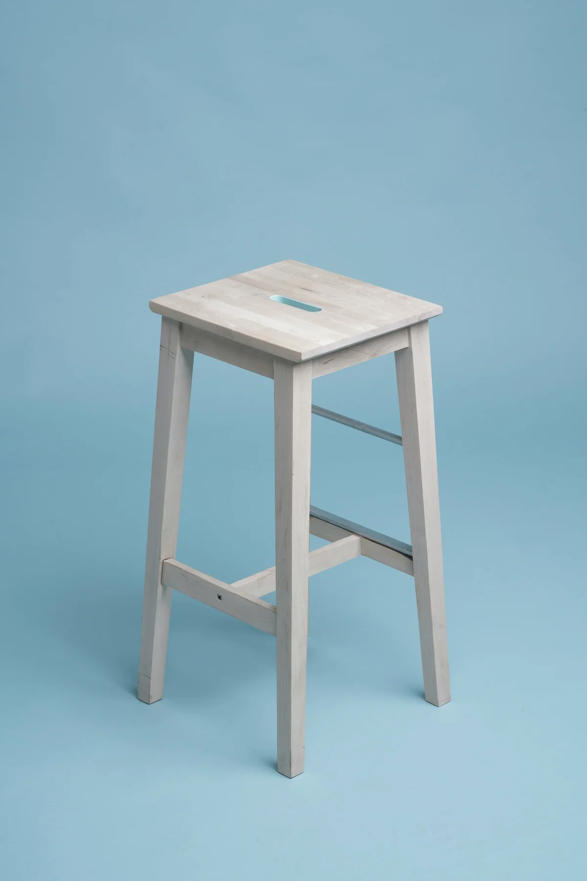
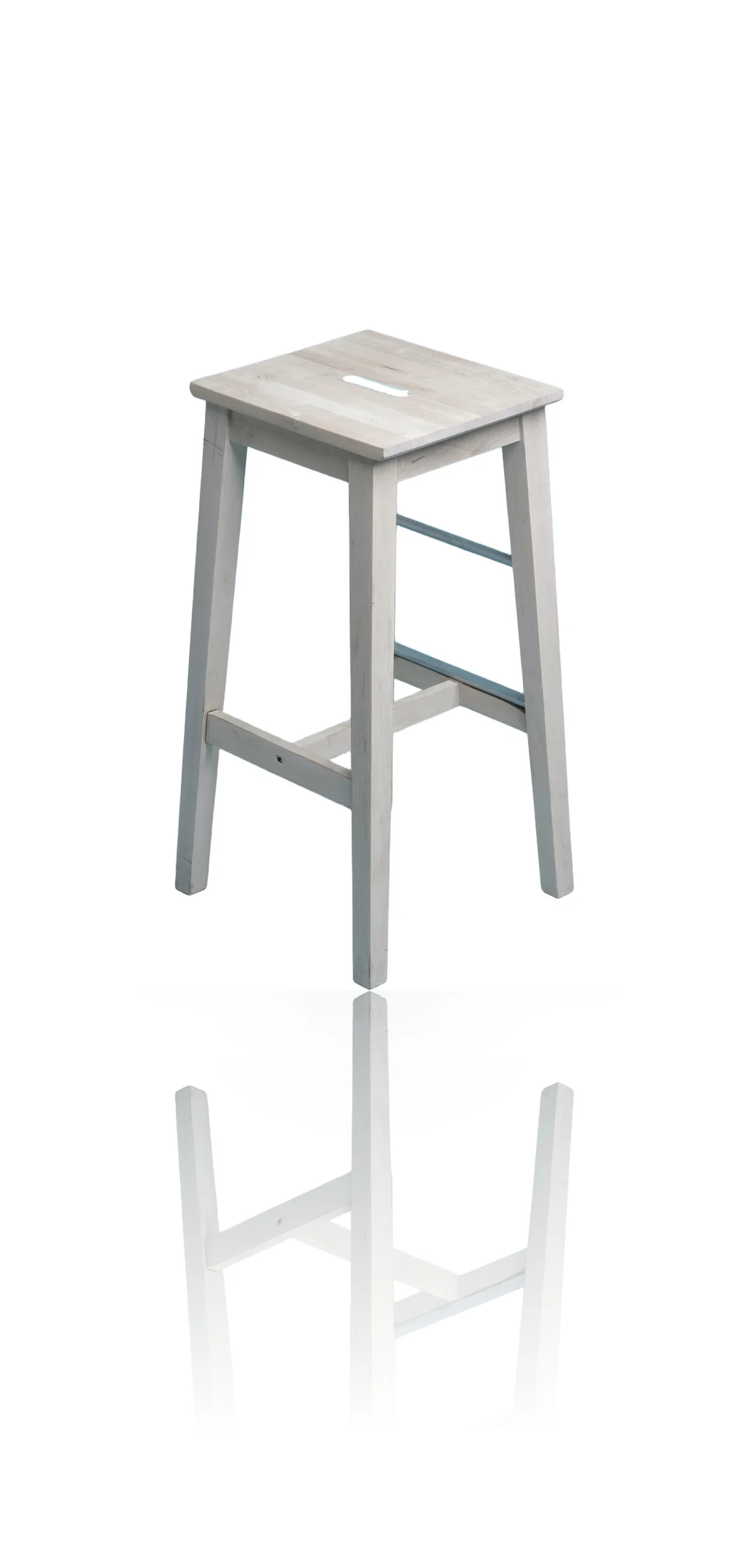
After
# Product Shadows & Reflections: Make Cut-Outs Look Studio-Shot in 2026
You removed the background, dropped the product onto clean white, and it still looks wrong. The cut-out floats. It reads like a sticker someone pasted onto the page rather than an object sitting on a shelf. Nothing is blurry, the edges are clean, the white is pure — and yet next to a competitor's listing it looks amateur. The missing ingredient isn't sharper edges or a whiter background. It's a shadow.
This guide covers why cut-out product photos look fake, what a contact shadow and a reflection actually do that a plain drop shadow can't, how to add both to a product photo without a studio, which surface to pick for your product, and how to keep the look consistent across a whole catalog.
Why Cut-Out Product Photos Look Fake
A cut-out looks fake because background removal deletes the one cue that told your eye the product was real: its shadow. In a real photo, every object casts a shadow where it meets a surface, grounding it in space. Strip that away and the brain reads "no contact, no surface" — so the product appears to float, and floating objects look pasted-on.
Your visual system judges depth from contact shadows before it consciously registers anything else. A ball resting on a table and a ball hovering above it can occupy the exact same spot in a photo; the only thing that tells them apart is the shadow underneath. Product photography works the same way. The moment you remove the background, you also remove the soft dark patch that anchored the item to the studio sweep — and the clean cut-out you are left with has lost the very signal that made it believable. Whiter backgrounds and sharper edges don't fix it, because they were never the problem. The fix is to put the grounding back.
Contact Shadow vs Drop Shadow vs Reflection: What Each One Does
Three different effects get called "the shadow," and they are not interchangeable. A contact shadow grounds the product to a surface, a drop shadow fakes depth against a flat backdrop, and a reflection implies a glossy surface beneath the product. For a believable studio look you want a contact shadow — optionally with a reflection — not the generic drop shadow most editors reach for.
- ●Contact shadow — the soft, dark pool directly under the product where it touches the surface. It is darkest and sharpest at the contact point and fades outward. This is the single most important cue for realism, because it tells the eye exactly where the product is sitting.
- ●Drop shadow — a uniform, offset shadow behind the whole object, the kind a design app applies with one click. It makes a logo pop on a slide, but on a product it reads as a graphic effect rather than a photograph — the even offset gives it away instantly.
- ●Reflection — a faded mirror image of the product below it, as if it were standing on glass or polished stone. It signals a premium, glossy surface and adds a sense of place. Used subtly it looks expensive; overdone it looks like a screensaver.
The studio look you are after is a realistic contact shadow, sometimes paired with a gentle reflection. The offset drop shadow is the tell-tale sign of an amateur edit — avoid it.
What Makes a Shadow Look Real, Not a Grey Blob
A believable shadow obeys the physics of light: it is anchored at the contact point, softens as it falls away, runs in a single consistent direction, and matches the softness of the light in the scene. A flat grey oval pasted under the product breaks all four rules at once, which is why hand-painted shadows so often look worse than none at all.
Real shadows follow a few consistent principles. The contact point — where the product meets the surface — is the darkest and most defined part; the shadow lightens and blurs the further it travels from there. It falls in one direction, set by a single dominant light, so a product lit from the upper left casts its shadow toward the lower right. And the edge softness of the shadow has to match the light: a hard studio spotlight throws a crisp shadow, while a big soft light box throws a diffuse one. Get any of these wrong and the eye notices, even if the viewer can't say why.
This is exactly the kind of judgment that is tedious to do by hand and easy to automate. When I built the shadow generator into EnhanceCraft, the goal was to encode those physics so you don't have to paint a shadow by hand and hope it looks right — the tool places the contact shadow, sets the falloff, and matches the reflection to the surface for you.
How to Add a Shadow and Reflection to a Product Photo
You don't need a studio, an acrylic riser, or an hour in a photo editor to ground a product. With EnhanceCraft's product shadow generator, you upload the cut-out, pick a surface, set the shadow and reflection, and download a studio-style image in one pass. Here is the full workflow:
- 1.Upload your product cut-out. Upload the product photo as a JPEG, PNG, or WebP up to 50 MB. A background-removed transparent PNG works best and skips a step; a normal photo works too, because the tool removes the background first if it needs to.
- 2.Pick a surface and set the shadow. Choose glass, matte, or wood to match your product, then set the shadow opacity, softness, and length. A short, soft, semi-opaque shadow reads as a real contact shadow; a long, hard, solid one reads as a fake.
- 3.Dial in the reflection. Set the reflection intensity — low for a subtle hint, high for a bold mirror finish — and choose a background color, usually pure white for a marketplace listing.
- 4.Download the studio-style image. Download the grounded result, ready to drop into your store. Reflection Shadow costs 2 credits on a transparent PNG, or 3 credits if the background is removed first, and a free account includes 25 credits every month.
The part that used to demand real props — a sheet of glass for the reflection, a light rig for the contact shadow — is now generated for you, which is why a plain cut-out on white is all you need as the input. It reconstructs a plausible shadow for the item you actually uploaded rather than reshaping the product.
Which Surface to Pick: Glass, Matte, or Wood
Match the surface to the product's material and price point: glass for shiny, premium goods; matte for soft or muted items; wood for warm, natural, lifestyle products. The surface sets the reflection style — a clean mirror for glass, a soft diffused sheen for matte, a warm textured glow for wood — so the wrong choice fights the product instead of flattering it.
| Surface | Reflection style | Best for |
|---|---|---|
| Glass | Clean mirror reflection | Cosmetics, bottles, electronics, jewelry, watches |
| Matte | Soft, diffused sheen | Clothing, bags, soft goods, muted-tone products |
| Wood | Warm, textured glow | Food, kitchenware, candles, lifestyle products |
If you are not sure, matte is the safe default — its soft reflection flatters almost anything and rarely looks overdone. Save the full glass mirror for products that genuinely live on glossy surfaces, like a perfume bottle or a phone, where a crisp reflection reinforces the premium feel.
Dialing In the Look: Opacity, Softness, Length & Reflection
The four sliders control how grounded — and how subtle — the result looks. Keep the shadow short and soft for a natural contact shadow, raise opacity for heavier products, and hold reflection intensity low for listings and higher for hero shots. Small values almost always look more professional than large ones.
- ●Shadow opacity controls how dark the shadow is. Heavier, denser products (a cast-iron pan, a glass jar) sit on a stronger shadow; light products (a folded scarf, a paper box) need a fainter one. Somewhere in the middle is a safe start.
- ●Shadow softness controls the edge. Soft, diffuse edges suit the even lighting of most e-commerce shots; keep it sharp only if you are deliberately recreating a hard-spotlight studio look.
- ●Shadow length controls how far the shadow stretches. Short keeps the product feeling planted directly on the surface; long implies a low, dramatic light and reads more like an art-direction choice than a clean product shot.
- ●Reflection intensity controls the mirror. For catalog and marketplace images, keep it low — a subtle hint of a reflection. Turn it up only for standalone hero images and banners where a dramatic, glossy finish is the point.
The most common mistake is turning everything up. A subtle, correct shadow does its job precisely by not being noticed — the product simply looks like it was photographed on a real surface.
Shadows, Marketplaces, and Honest Listings
Shadows and reflections are allowed on marketplace listings, but the rules and the goal both point the same way: keep it clean and keep it honest. Amazon requires the main product image to sit on a pure-white background, and a soft contact shadow sits naturally on white without breaking that rule — while bolder reflections belong on your secondary and lifestyle images.
It is worth the effort. In Salsify's 2026 Consumer Research, 61% of shoppers said they rely on high-quality images or videos to make a purchase decision — the single most-cited factor, ahead of the product title and description. A grounded, studio-looking photo is doing conversion work, not just decoration.
The honesty rule matters as much as the marketplace rule. A shadow and reflection should make your product look like it was photographed well — not like a different, more expensive product. That is the same principle behind everything in EnhanceCraft's AI image toolkit: enhance faithfully, so what the shopper sees is what they receive.
Doing a Whole Catalog at Once
A single studio-looking product is nice; a whole catalog with one consistent shadow and surface is what makes a storefront look like a real brand. Batch mode applies the same surface, shadow, and reflection settings across every image in one job, so the tenth product is grounded exactly like the first — no drift, no per-image guesswork.
Consistency is the quiet difference between a store that looks professional and one that looks improvised. Shoot every product the same way, run them through the shadow generator with one shared setting, and the category page reads as a coherent set rather than a folder of mismatched photos. For the rest of the listing workflow, pair this with the full product photo pipeline that gets images marketplace-ready, use the ghost mannequin effect for apparel, and lean on batch processing to run the whole set at once. It all runs in the browser as part of the complete e-commerce workflow, with no software to install and pay-as-you-go credits that never expire.
From Floating Cut-Out to Studio Shelf
The reason a background-removed product looks fake is almost never the cut-out — it is the missing shadow. Put back the contact shadow and a subtle reflection and the same photo stops floating and starts looking like it was shot on a studio surface. No riser, no glass sheet, no hour of manual masking: upload the cut-out, pick a surface, set the shadow, and download.
Try the free product shadow generator — 25 credits every month, no card required, and pay-as-you-go credits that never expire. Turn a page of floating cut-outs into a catalog that looks studio-shot.
Found this helpful?
Share it with your network
Ready to try it yourself?
25 free credits every month. No credit card. Process your first image in under 15 seconds.
Try Product Shadow Generator freeMunib Ali Laghari
Founder & Lead Developer · EnhanceCraft
Munib Ali Laghari is the founder and lead developer of EnhanceCraft, an AI image toolkit. He writes about AI upscaling, photo restoration, and background removal. Connect on LinkedIn